Each concept has a home page, a weddings page and a mood board. They use real prices and real photos. They are starting points — colours, type and layout can be mixed between them. As you browse, use the Notes button in the corner to jot down what you love (or don't) — your notes are saved on this device for each concept.
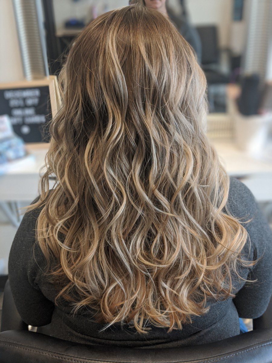
Photo: Kelsey Vera Photography
Concept A
Aubergine & Veil
Her existing purple, grown up. A fashion-magazine serif, soft veil backgrounds and overlapping photographs. Balanced between studio clients and brides, with the ten-year mark front and centre.
—Refined editorial grid with overlapping photos and a champagne ten-year seal
—Dotted-leader price menu that reads like a printed salon menu
—Clearer two-door entry: studio clients vs wedding parties
Bright, friendly and built around booking. Prices are on the first screen, photos sit in arches that echo the studio mirror, and everything is one tap from a booking. The most modern of the three.
—Interactive service picker: pick a category, see the price, book
—Filterable gallery of cuts, colour, updos and weddings
—'First visit?' block answers parking and prep before anyone asks
Dark, cinematic and weddings first. Full-screen mountain photography, the Calgary-to-Banff travel route on the first screen, and real weddings as the main content.
—Travel route with fees sits right in the hero
—Real weddings with venue and photographer credits as the core content
—Working estimate calculator and Vendor Love directory
 Photo: Kelsey Vera Photography